Shifting over from brains to brawn, we now take a look at another of the original four trade evolutions and arguably the standard bearer for what the idea of a Fighting type Pokemon was originally envisioned as: the Machamp family.
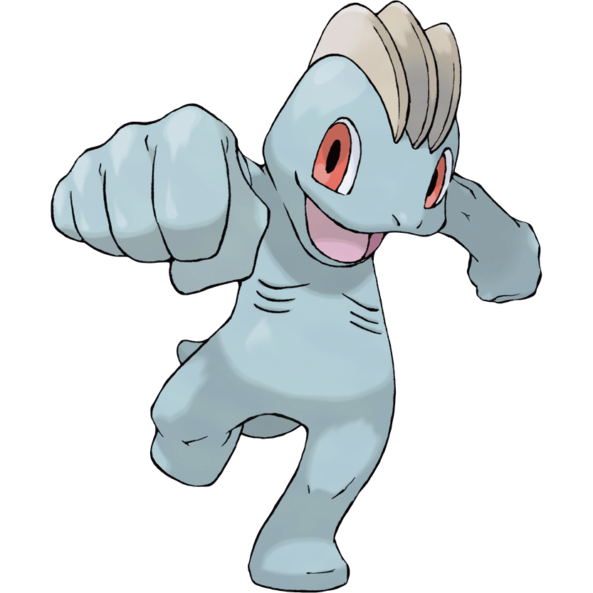
Machop starts by giving me not too much to talk about with a pretty plain design. It’s a very simple grey humanoid creature with very few defining characteristics other than the unusual beige ridges on its head, which are preserved throughout the entire evolution line as an aesthetic feature but aren’t exactly consequential. It does do a fairly good job of projecting strength, looking like a sturdy and well-built creature, but the lines on its chest seem weirdly out of place and almost give the image of Machop being malnourished, which I doubt was the intended effect. Beyond this there’s not too much to add; it seems to be vaguely lizard-like but beyond a tail and its jaw that doesn’t seem too pronounced, though that is both accentuated and lessened as it evolves.
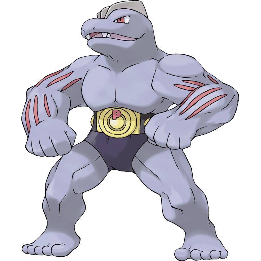
Machoke is where we get into proper musclehead territory. There is no attempt to be cute or in any way subtle here; it’s got a burly physique with muscles so extreme they look like veins are popping out, and while the tail is gone, the jaw is unmistakably that of a beastly reptile monster now. What I think this line was at least somewhat intended to do was be Pokemon’s answer to the trope of burly, martial lizard monster enemies seen in typical fantasy RPGs like Zelda, D&D, or Dragon Quest. However Machoke is definitely skewing far more on the side of being both a friendlier and more humanoid take for a series that can’t rely on it just being a lizard with a sword that’s morally okay to slaughter. While I don’t think they quite stuck the landing in visualising that concept, the execution is solid enough. An obvious point of criticism is the championship belt that both it and Machamp wear, which just materialised from nowhere upon evolution with a belt so large it covers everything below the ribcage. I can’t say I’m a huge fan of this or think it’s particularly elegant design, but weirdly I don’t find much wrong with it? Certainly I find Machoke hard to imagine without it, and despite it being a bit silly it does give Machoke a goofy charm it would otherwise sorely lack.
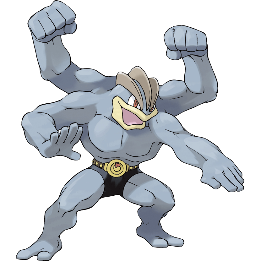
Machamp continues this line’s somewhat confused trend of getting both more and less humanoid in conflicting ways, but still managing to pull a net positive out of it. Aside from the aforementioned beige ridges making for something like a lizard’s crest, Machamp basically abandons any attempt at being substantially lizard-like with its jaw once again changing. Machamp’s appeal however is direct and immediately obvious: it’s got four huge arms to punch with the speed and force of a gatling gun, and that’s just plain fun. The move to four arms is a huge benefit to making this Pokemon a far sight less generic, though it still comes up on the plain side as Fighting types go. Machamp is far from a bad Pokemon, but as the standard bearer for a whole type, and particularly one which hasn’t always had the clearest idea of what its element actually represents, it feels like Machamp has been left behind somewhat. Between acting as a counter to Dark types and the introduction of Pokemon like Lucario, Gallade, and Mienshao in later generations, Fighting has developed connotations of stalwart heroism and focused martial discipline, rather than just raw physical power. However Machamp was created before that identity really existed and it shows. Just as in concept as it is in battle (the dire straits of being a Fighting type in Generation 1 notwithstanding), Machamp is a blunt instrument: lacking in much aesthetic depth but being generally decent at what it does.
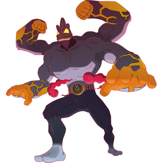
In what almost feels like some kind of twisted callback to Alakazam and Machamp being counterparts in Red and Blue where the former just flatly outclassed and destroyed the latter, Machamp’s answer to being deprived a Mega Evolution has been found in a forgettable Gigantamax form. There’s a lot to talk about here and I’ve got to say, not much is positive. While I defended the silliness of the championship belt and underwear before, now that it’s grown into full length black trousers with a baffling fade at the ankles, it’s pretty much lost me. Black is said to be a slimming colour, but the effect of trying to accentuate Machamp’s muscles with this makes it look ridiculous and top heavy. I don’t know what they were doing with the head and neck changes, particularly the off-colour effect that makes Machamp look like it’s in a muscle suit, but all of this is just background elements for the star of the show: the four huge arms. Them being overbearing in size is good, and the idea of them being brimming with almost molten power is okay, but it just doesn’t quite stick the landing enough to be compelling and just looks arbitrarily orange. As if to add insult to injury, there’s almost no reason to use it when it has to lose out on the Attack boosting Max Knuckle in favour of its far more underwhelming G-Max Chi Strike. Overall, not a great showing from one of the alleged “three most popular Pokemon in Galar” as described by a poster in-game in Sword and Shield.
Final Verdict: 5/10 – not especially fantastic, but it gets the job done.
Gigantamax Final Verdict: 3/10 – an underwhelming nostalgia bait G-Max that makes messy design choices for a forgettable gimmick
